
so keep or keep trying noob?
Edited by Halcomb the Horrible, 21 December 2006 - 01:25 AM.


Posted 21 December 2006 - 01:24 AM
Edited by Halcomb the Horrible, 21 December 2006 - 01:25 AM.
BoSS Fantasy Football 2010 Champ

Posted 21 December 2006 - 03:36 AM
Posted 21 December 2006 - 03:48 AM
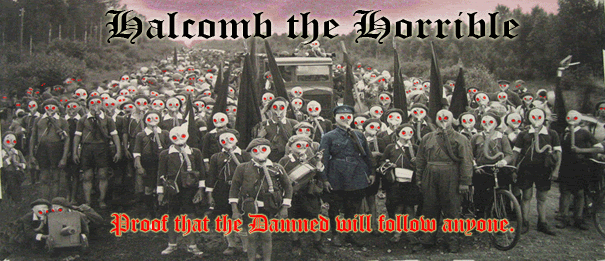
I like it. Make the pic a bit smaller and change text as necessary and it's a keeper.
BoSS Fantasy Football 2010 Champ
Posted 21 December 2006 - 03:52 AM
Posted 21 December 2006 - 04:03 AM
No, i like the quote. It has character. It's just hard to read. And the text along the top really suites the pic, so dont change that.

BoSS Fantasy Football 2010 Champ
Posted 21 December 2006 - 04:07 AM
Posted 21 December 2006 - 04:08 AM
Much better, but the text is still a little too difficult (maybe it's just me). Im not very good with this stuff so someone better than me will probably be able to tell you exactly what you need. Going to sleep now.
BoSS Fantasy Football 2010 Champ
Posted 21 December 2006 - 04:10 AM
Posted 21 December 2006 - 04:18 AM
Edited by Halcomb the Horrible, 21 December 2006 - 04:22 AM.
Posted 21 December 2006 - 04:28 AM
Oh and the pic is pretty wicked. Where's it from?
Edited by Halcomb the Horrible, 21 December 2006 - 04:33 AM.
Smoke Bluntz

Posted 21 December 2006 - 10:18 AM
I AM DEATH INCARNATE

Posted 21 December 2006 - 01:03 PM
 ). Looks like the French army btw, and as such, it was either Austro-Hungarian propaganda, or pre-WWII Nazi propaganda.
Zombie

Posted 21 December 2006 - 04:22 PM
Posted 21 December 2006 - 10:06 PM
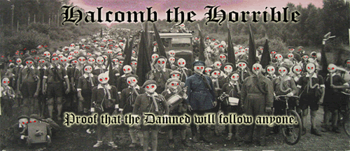
give it a white transparent outline.....see how it looks, and maybe make the bottom text slightly bigger
Guitar God

Posted 22 December 2006 - 09:19 AM
Zombie
Posted 22 December 2006 - 09:36 AM
Zombie
Posted 22 December 2006 - 09:51 AM

Posted 23 December 2006 - 07:01 PM
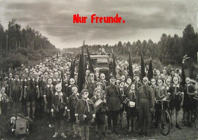
i felt like playing around with it a bit.
Zombie
Posted 23 December 2006 - 11:28 PM
lol. sweet. the text looks like something from a pirate movie.
0 members, 0 guests, 0 anonymous users

